The Play Boxes
Creative Direction, Packaging Design, Photo/Video

About the Project
During my time as Creative Director, I had the pleasure of expanding our product line into a new category; toys. I led the marketing team as we built an identity for this product from the ground up.
Key Deliverables: Visual identity, packaging, photography, video (tv commercial & play guides for each box), email, social, website & more.
This packaging design & identity earned 2nd place in The Dieline 2024 Awards in the category.
Project Type Product Launch
Role Creative Director, Art Director, Designer
Tools Illustrator, Figma, Google Suite
These 10 shapes are created from 5 base forms, when combined and/or skewed they from new shapes that comprise this system.
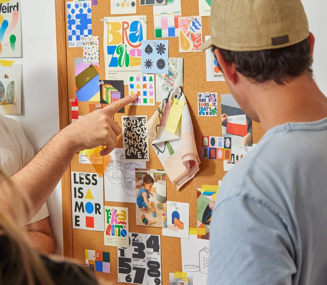
The minimal, yet playful aesthetic is inspired by they key tenets of Bauhaus design, and the idea of looking at the world through a child’s lens; finding total wonder in the discovery of the simplest things. Lalo is a brand that makes kid’s products for the adults in the room, so while the design system takes inspiration from the eyes of a child, the execution of the design is created with parents in mind.


